- ホーム
- Microsoft
- AI-900J - Microsoft Azure AI Fundamentals (AI-900日本語版)
- Microsoft.AI-900J.v2026-01-17.q150
- 質問88
有効的なAI-900J問題集はJPNTest.com提供され、AI-900J試験に合格することに役に立ちます!JPNTest.comは今最新AI-900J試験問題集を提供します。JPNTest.com AI-900J試験問題集はもう更新されました。ここでAI-900J問題集のテストエンジンを手に入れます。
AI-900J問題集最新版のアクセス
「328問、30% ディスカウント、特別な割引コード:JPNshiken」
文を正しく完成させる答えを選択してください。
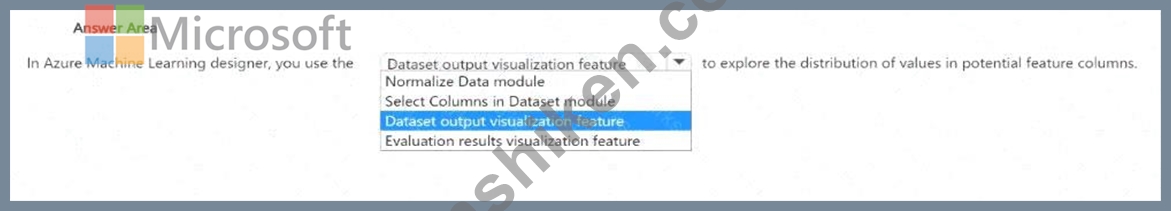
正解:
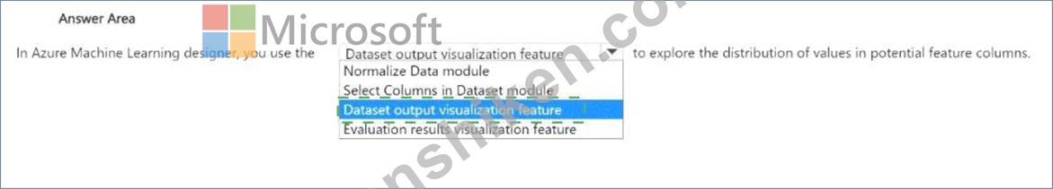
Explanation:
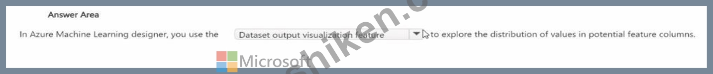
In Azure Machine Learning Designer, the Dataset output visualization feature is specifically used to explore and understand the distribution of values in potential feature columns before model training begins. This capability is critical for data exploration and preprocessing, two essential stages of the machine learning pipeline described in the Microsoft Azure AI Fundamentals (AI-900) and Azure Machine Learning learning paths.
When a dataset is imported into Azure Machine Learning Designer, users can right-click on the dataset output port and select "Visualize". This launches the dataset visualization pane, which provides detailed statistical summaries for each column, including:
* Data type (numeric, categorical, string, Boolean)
* Minimum, maximum, mean, and standard deviation values for numeric columns
* Frequency counts and distinct values for categorical columns
* Missing value counts
This visual inspection helps determine which columns should be used as features, which might need normalization or encoding, and which contain missing or irrelevant data. It is a vital step in ensuring the dataset is clean and ready for model training.
Let's examine why other options are incorrect:
* Normalize Data module is used to scale numeric data, not to visualize distributions.
* Select Columns in Dataset module is used to include or exclude columns, not to analyze them.
* Evaluation results visualization feature is used after model training to interpret performance metrics like accuracy or recall, not data distributions.
Therefore, based on official Microsoft documentation and AI-900 study materials, to explore the distribution of values in potential feature columns, you use the Dataset output visualization feature in Azure Machine Learning Designer.

- 質問一覧「150問」
- 質問1 コンピュータビジョンを使用して実行できる2つのタスクは何です
- 質問2 法的文書から当事者と管轄区域を抽出するには、どの Azure Al Do...
- 質問3 次の各ステートメントについて、ステートメントがtrueの場合は、...
- 質問4 文を正しく完成させる答えを選択してください。 (Exhibit)...
- 質問5 文を正しく完成させる答えを選択してください。 (Exhibit)...
- 質問6 スキャンしたドキュメントからテキスト、キーと値のペア、テーブ
- 質問7 写真に写っている動物の数を数える必要があります。どのタイプの
- 質問8 電子商取引ビジネス用の会話型言語理解モデルを構築しました。
- 質問9 ローンを承認する必要があるかどうかを評価するAIシステムを設計...
- 質問10 ある地域における特定の動物種の個体数を予測する必要があります
- 質問11 文を正しく完成させる答えを選択してください。 (Exhibit)...
- 質問12 サービスを適切な説明に一致させます。 回答するには、適切なサ
- 質問13 文を正しく完成させる答えを選択してください。 (Exhibit)...
- 質問14 画像内の鳥を識別するアプリがあります。アプリは次のタスクを実
- 質問15 膨大なコーディングなしで予測モデルを迅速に構築してデプロイす
- 質問16 モデルのトレーニングに使用されたデータのソースを明記すること
- 質問17 サングラスをかけている人の写真をTwitterに投稿するチャリティ...
- 質問18 テキスト データ内の名前と電話番号のマスキングを自動化するに
- 質問19 QnA Makerボットは、よくある質問(FAQ)ページを使用して作成し...
- 質問20 次の各ステートメントについて、ステートメントがtrueの場合は、...
- 質問21 文を正しく完成させる答えを選択してください。 (Exhibit)...
- 質問22 画像からテキストをキャプチャすることは、どのタイプの AI 機能...
- 質問23 次の各ステートメントについて、ステートメントがtrueの場合は、...
- 質問24 「後で電話をかけ直してください」などのユーザー入力の意味を解
- 質問25 Azure Al サービスを適切なアクションに一致させます。 回答する...
- 質問26 次の各ステートメントについて、ステートメントがtrueの場合は、...
- 質問27 文を正しく完成させる答えを選択してください。 (Exhibit)...
- 質問28 次の各ステートメントについて、ステートメントがtrueの場合は、...
- 質問29 Azure OpenAI サービスを呼び出すために使用できる 2 つのツール...
- 質問30 自然言語処理を使用して、Microsoftニュース記事のテキストを処...
- 質問31 文を正しく完成させる答えを選択してください。 (Exhibit)...
- 質問32 教師なし機械学習の例は何ですか?
- 質問33 分類モデルを評価するためにどのメトリックを使用できますか?
- 質問34 大量の非構造化データからデータ間の関係を抽出することは、どの
- 質問35 文を完成させるには、回答領域で適切なオプションを選択します。
- 質問36 自然言語処理(NLP)を使用して、ユーザーのテキスト入力に基づ...
- 質問37 文を正しく完成させる答えを選択してください。 (Exhibit)...
- 質問38 次の各ステートメントについて、ステートメントがtrueの場合は、...
- 質問39 スキャンした請求書を分析し、請求先住所や合計金額などのデータ
- 質問40 AI ワークロードを適切なタスクに一致させます。 回答するには、...
- 質問41 次の各ステートメントについて、ステートメントがtrueの場合は、...
- 質問42 次の各ステートメントについて、ステートメントがtrueの場合は、...
- 質問43 Webチャットボットの例はどのシナリオですか?
- 質問44 責任あるAIに関するマイクロソフトの指導原則を適切な説明に一致...
- 質問45 機械学習分類モデルによって生成される誤検出の数を減らすにはど
- 質問46 Microsoft の責任ある AI 透明性原則の例は何ですか?...
- 質問47 文を正しく完成させる答えを選択してください。 (Exhibit)...
- 質問48 QnAMakerナレッジベースからの応答を提供するWebチャットボット...
- 質問49 カスタムの質問応答ソリューションがあります。 ナレッジ ベース...
- 質問50 文を完成させるには、回答領域で適切なオプションを選択します。
- 質問51 次のアプリがあります: * アプリ1: 画像と写真のセットを使用し...
- 質問52 回帰モデルを評価するために使用できる2つのメトリックは何です
- 質問53 文を完成させるには、回答領域で適切なオプションを選択します。
- 質問54 ある会社は、顧客サービスエージェントのチームを雇用して、顧客
- 質問55 あなたは、小売店からの画像を処理し、競合他社の製品を識別する
- 質問56 高速道路上の車両の画像を分析し、車両間の距離を測定する必要が
- 質問57 文を完成させるには、回答領域で適切なオプションを選択します。
- 質問58 次の各ステートメントについて、ステートメントがtrueの場合は、...
- 質問59 自動機械学習ユーザーインターフェイス(UI)を使用して、機械学...
- 質問60 文を正しく完成させる答えを選択してください。 (Exhibit)...
- 質問61 次の各ステートメントについて、ステートメントがtrueの場合は、...
- 質問62 文を正しく完成させる答えを選択してください。 (Exhibit)...
- 質問63 次の各ステートメントについて、ステートメントがtrueの場合は、...
- 質問64 従業員とその写真のリストを含むデータベースがあります。 従業
- 質問65 あなたの会社は、ボトルのリサイクル機を作りたいと考えています
- 質問66 文を完成させるには、回答領域で適切なオプションを選択します。
- 質問67 文を正しく完成させる答えを選択してください。 (Exhibit)...
- 質問68 Azure Cognitive Services を使用して、音声制御のパーソナル ア...
- 質問69 次の各ステートメントについて、ステートメントがtrueの場合は、...
- 質問70 ソーシャル メディアの投稿を分析してそのトーンを特定するアプ
- 質問71 Webサイト用のチャットボットを開発する必要があります。チャッ...
- 質問72 文を完成させるには、回答領域で適切なオプションを選択します。
- 質問73 視力が低下しているユーザーをサポートするために、レシピの説明
- 質問74 生成 AI ソリューションによって憎悪的な応答が返されるのを防ぐ...
- 質問75 コンピュータビジョンサービスを使用して実行できる2つのタスク
- 質問76 文を正しく完成させる答えを選択してください。 (Exhibit)...
- 質問77 あなたの会社はウィジェットを製造しています。 ウィジェットの
- 質問78 臨床データを使用して患者が病気に罹患しているかどうかを予測す
- 質問79 車間の距離を推定できるように、画像内の車の位置を特定する必要
- 質問80 文を正しく完成させる答えを選択してください。 (Exhibit)...
- 質問81 燃料サンプルの実験データを含むデータセットがあります。 サン
- 質問82 個人のデジタル写真のコレクションにラベルを付けるモデルを作成
- 質問83 文を正しく完成させる答えを選択してください。 (Exhibit)...
- 質問84 クライアントアプリケーションで使用されるサービスとして、Azur...
- 質問85 簡単なユーザークエリに答えるのに役立つビジネスチャットボット
- 質問86 テキストとして保存されている保険金請求レポートがあります。
- 質問87 あなたは音楽祭をサポートするための言語理解(LUIS)アプリケー...
- 質問88 文を正しく完成させる答えを選択してください。 (Exhibit)...
- 質問89 Azure Al Vision サービスを使用して実行できるアクションはどれ...
- 質問90 AIベースのアプリを構築しています。 アプリが責任あるAIの原則...
- 質問91 Azure OpenAI の REST API エンドポイントにリクエストを送信す...
- 質問92 文を正しく完成させる答えを選択してください。 (Exhibit)...
- 質問93 文を正しく完成させる答えを選択してください。 (Exhibit)...
- 質問94 画像をComputerVision APIに送信し、展示に示されている注釈付き...
- 質問95 ツールをAzureMachineLearningタスクに一致させます。 答えるに...
- 質問96 ユーザーが提供した文に基づいて段落を完成させるには何を使用で
- 質問97 次の各ステートメントについて、ステートメントがtrueの場合は、...
- 質問98 文を正しく完成させる答えを選択してください。 (Exhibit)...
- 質問99 あなたはeコマースビジネスのための言語理解モデルを構築してい
- 質問100 クラスタリング モデルを作成し、Azure Machine Learning デザイ...
- 質問101 文を完成させるには、回答領域で適切なオプションを選択します。
- 質問102 次の各ステートメントについて、ステートメントがtrueの場合は、...
- 質問103 Microsoft の責任ある AJ 原則の一例は次のうちどれですか?...
- 質問104 Azure OpenAI 大規模言語モデル (LLM) プロセスを適切なタスクに...
- 質問105 次のアプリがあります: * アプリ1: 腫瘍の画像セットを使用して...
- 質問106 既存のデータセットからトレーニングデータセットと検証データセ
- 質問107 文を完成させるには、回答領域で適切なオプションを選択します。
- 質問108 次の各ステートメントについて、ステートメントがtrueの場合は、...
- 質問109 文を正しく完成させる答えを選択してください。 (Exhibit)...
- 質問110 ユーザーのプロンプトに基づいてイメージを生成する必要がありま
- 質問111 コンピューター ビジョン サービスを適切な Al ワークロードに合...
- 質問112 Azure Al Document Intelligence の事前構築済み領収書モデルを...
- 質問113 次の展示に示すプロセスがあります。 (Exhibit) 図に示されてい...
- 質問114 次の展示に示す予測対真のチャートがあります。 (Exhibit) チャ...
- 質問115 次の各ステートメントについて、ステートメントがtrueの場合は、...
- 質問116 画像セット内の類似した顔を識別するには何を使用すればよいです
- 質問117 顧客が情報にアクセスできるように、カスタマーサポートソリュー
- 質問118 文を完成させるには、回答領域で適切なオプションを選択します。
- 質問119 文を完成させるには、回答領域で適切なオプションを選択します。
- 質問120 QnAMakerを使用してナレッジベースを構築しています。ナレッジベ...
- 質問121 音声合成ソリューションを使用できるシナリオは2つありますか?
- 質問122 契約書のスキャン画像から詳細を抽出するには何を使用すればよい
- 質問123 責任あるAIの原則を適切な説明に一致させます。 答えるには、適...
- 質問124 文を完成させるには、回答領域で適切なオプションを選択します。
- 質問125 Azure OpenAI モデルが最近のイベントを含む正確な応答を生成す...
- 質問126 文を正しく完成させる答えを選択してください。 (Exhibit)...
- 質問127 次の各ステートメントについて、ステートメントがtrueの場合は、...
- 質問128 今後10年間の海面をメートル単位で予測する必要があります。 ど...
- 質問129 コンピューター ビジョンを使用できる 2 つのワークロードはどれ...
- 質問130 生成 AI ソリューションの一般的な使用例を 2 つ挙げてください...
- 質問131 文を正しく完成させる答えを選択してください。 (Exhibit)...
- 質問132 AIワークロードのタイプを適切なシナリオに一致させます。 答え...
- 質問133 機械学習タスクを適切なシナリオに一致させます。 答えるには、
- 質問134 Azure OpenAI GPT-3.5 大規模言語モデル (LLM) を使用して技術的...
- 質問135 文を正しく完成させる答えを選択してください。 (Exhibit)...
- 質問136 異常検出に使用できる機械学習手法はどれですか?
- 質問137 変圧器モデルの 3 つのステージとは何ですか? それぞれの正解は...
- 質問138 次の各ステートメントについて、ステートメントがtrueの場合は、...
- 質問139 会話型 AI ワークロードの例となるシナリオを 2 つ挙げてくださ...
- 質問140 ある地域の動物の個体数を予測する必要があります。 どの Azure ...
- 質問141 友達の画像に自動的にタグを付けるソーシャルメディア用の画像タ
- 質問142 コンピュータビジョンの種類を適切なシナリオに一致させます。
- 質問143 顔認識タスクを適切な質問に一致させます。 回答するには、適切
- 質問144 次の各ステートメントについて、ステートメントがtrueの場合は、...
- 質問145 文を正しく完成させる答えを選択してください。 (Exhibit)...
- 質問146 TextAnalyticsサービスを使用するソリューションを開発していま...
- 質問147 教師なし機械学習の形式とは何ですか?
- 質問148 文を完成させるには、回答領域で適切なオプションを選択します。
- 質問149 Form Recognizer でカスタム モデルを使用する利点は何ですか?...
- 質問150 文を正しく完成させる答えを選択してください。 (Exhibit)...
