- ホーム
- CompTIA
- DA0-001J - CompTIA Data+ Certification Exam (DA0-001日本語版)
- CompTIA.DA0-001J.v2024-06-10.q106
- 質問77
有効的なDA0-001J問題集はJPNTest.com提供され、DA0-001J試験に合格することに役に立ちます!JPNTest.comは今最新DA0-001J試験問題集を提供します。JPNTest.com DA0-001J試験問題集はもう更新されました。ここでDA0-001J問題集のテストエンジンを手に入れます。
DA0-001J問題集最新版のアクセス
「365問、30% ディスカウント、特別な割引コード:JPNshiken」
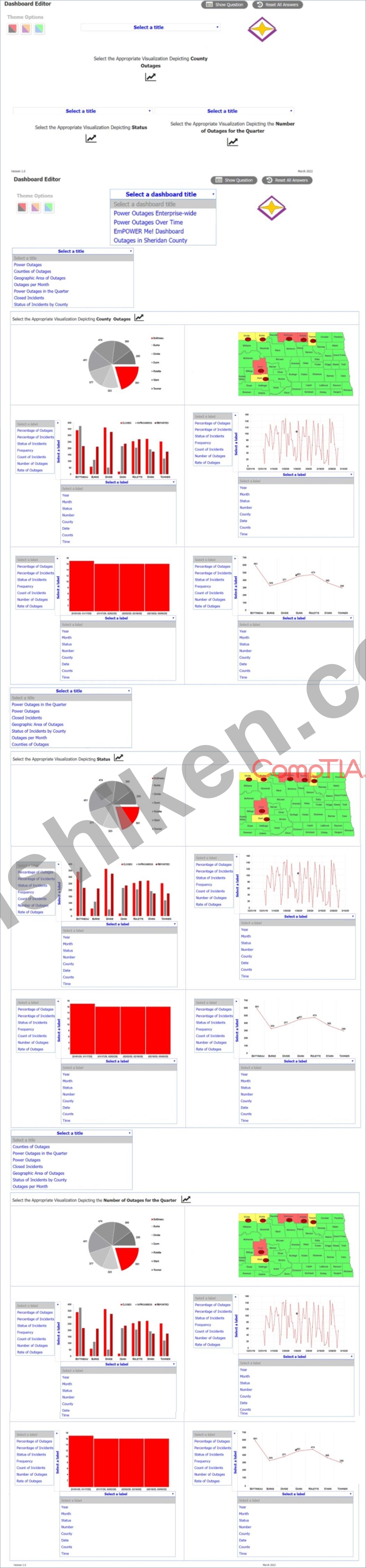
電力会社の運用責任者は、州全体の停電と電力復旧の活動を監視するために、会社のリソースをどこに割り当てるべきかを特定するのに役立つデータを必要としています。具体的には、ディレクターは次のことを確認したいと考えています。
*郡の停電
* 状態
* 停止の全体的な傾向
説明書:
ダッシュボード上の適切なスペースに合わせて各ビジュアライゼーションを選択し、適切な配色を選択してください。すべてのビジュアライゼーションを選択したら、該当する場合は適切なタイトルとラベルを選択してください。
タイトルとラベルは複数回使用できます。
シミュレーションの初期状態に戻したい場合は、[すべてリセット] ボタンをクリックしてください。
*郡の停電
* 状態
* 停止の全体的な傾向
説明書:
ダッシュボード上の適切なスペースに合わせて各ビジュアライゼーションを選択し、適切な配色を選択してください。すべてのビジュアライゼーションを選択したら、該当する場合は適切なタイトルとラベルを選択してください。
タイトルとラベルは複数回使用できます。
シミュレーションの初期状態に戻したい場合は、[すべてリセット] ボタンをクリックしてください。
正解:
Power outages
Explanation:
This is a simulation question that requires you to create a dashboard with visualizations that meet the director's needs. Here are the steps to complete the task:
Drag and drop the visualization that shows the county outages on the top left space of the dashboard. This visualization is a map of the state with different colors indicating the number of outages in each county. You can choose any color scheme that suits your preference, but make sure that the colors are consistent and clear. For example, you can use a gradient of red to show the counties with more outages and green to show the counties with less outages.
Drag and drop the visualization that shows the status of the outages on the top right space of the dashboard. This visualization is a pie chart that shows the percentage of outages that are active, restored, or pending. You can choose any color scheme that suits your preference, but make sure that the colors are distinct and easy to identify. For example, you can use red for active, green for restored, and yellow for pending.
Drag and drop the visualization that shows the overall trend of outages on the bottom space of the dashboard. This visualization is a line graph that shows the number of outages over time. You can choose any color scheme that suits your preference, but make sure that the color is visible and contrasted with the background. For example, you can use blue for the line and white for the background.
Select appropriate titles and labels for each visualization. Titles and labels may be used more than once. For example, you can use "County Outages" as the title for the map, "Status" as the title for the pie chart, and "Trend" as the title for the line graph. You can also use "County", "Number of Outages", "Active", "Restored", "Pending", "Time", and "Number of Outages" as labels for the axes and legends of the visualizations.

- 質問一覧「106問」
- 質問1 以下の表を考慮すると、次のようになります。 (Exhibit) 次の変...
- 質問2 調査結果に 100% の参加が必要な場合、データ アナリストは次の...
- 質問3 5 匹の犬の身長は次のミリメートルです。 300、430、170、470、6...
- 質問4 データ アナリストは、以下のサンプル スキーマに 40,000 行を超...
- 質問5 アナリストがディレクターのプロジェクトに取り組んでいます。こ
- 質問6 データ漏洩が発生する可能性を軽減するために、データを送信する
- 質問7 データ分析レポートのビジネス要件を理解した後、次に達成する必
- 質問8 DISTINCT 関数を適用すると、次のデータ クレンジングの問題のう...
- 質問9 以下の画像を考えてみます。 (Exhibit) 次のファイル形式のうち...
- 質問10 アナリストは、新規顧客の割合が最も高いサイトを特定するダッシ
- 質問11 ある開発会社が、その集合住宅に新しいユニットを建設しています
- 質問12 データ アナリストは、既存の変数「収入」に基づいて計算される
- 質問13 Amanda は、他の多くのデータ ソースから情報を引き出してビジネ...
- 質問14 顧客アンケートでは 90% が肯定的なフィードバックを示していま...
- 質問15 構造化データの例は次のうちどれですか?
- 質問16 病院データベースのテーブルには、患者の身長 (インチ) の列と患...
- 質問17 データセットを操作していて、行の値を列の値と交換する必要があ
- 質問18 次の表があるとします。 (Exhibit) 上記のテーブルの FULL JOIN ...
- 質問19 次のうち、データ統合中にデータを収集、ブレンド、およびロード
- 質問20 サマンサは、組織の上位 50 人の顧客のリストを営業担当副社長と...
- 質問21 アナリストは次のデータをレビューします。 7 3 5 2 3 7 7 10 モ...
- 質問22 会社のマーケティング部門は、来月プロモーション キャンペーン
- 質問23 調査アナリストは、分析対象のデータが他のデータポイントに接続
- 質問24 次の統計手法のうち、2 つ以上のカテゴリ変数が必要なのはどれで...
- 質問25 暗号化は、データを保護するためのメカニズムです。 いつデータ
- 質問26 XXX-XXX-XXXX としてフォーマットされた電話番号が考慮されるデ...
- 質問27 データ アナリストは、販売のストーリーを提供し、顧客ごとの販
- 質問28 次のクエリ最適化手法のうち、特定のタスクに必要なデータのみを
- 質問29 次のうち、離散データ型の例はどれですか?
- 質問30 次の値のうち、テストでの 10 人の生徒の得点の間の分散の「範囲...
- 質問31 マーケティング分析チームは、2 つの異なるソースから顧客トラン...
- 質問32 データ アナリストがパラメーター化を使用してクエリを最適化す
- 質問33 データ アナリストは、最初に INNER JOIN を実行し、次に LEFT J...
- 質問34 ミリ秒単位の通話時間の例は次のとおりです。
- 質問35 5 匹の犬の体高は次のとおりです (ミリメートル単位)。 300、430...
- 質問36 データ アナリストは、最高経営責任者 (CEO) のためにアドホック...
- 質問37 若い Web 開発者が、ユーザーが短い動画をアップロードできる新...
- 質問38 最高経営責任者が要求するハイレベルな年末レポートに最も適して
- 質問39 データ アナリストは、最近完了したマーケティング キャンペーン...
- 質問40 ある企業の人事部門は、データ アナリストに全従業員の収入を次
- 質問41 データ アナリストは、差異が大きいため、データ セットから外れ...
- 質問42 アナリストは、データ品質の検証を依頼されました。品質管理の目
- 質問43 次のデータテーブルがあるとします。 (Exhibit) データ クレンジ...
- 質問44 正規化されたディメンション テーブルを特徴とするデータベース ...
- 質問45 調査データを確認しているときに、調査アナリストは、1 つの質問...
- 質問46 データ クレンジングを実行する理由は次のうちどれですか? (2 つ...
- 質問47 次のうち、解釈された高レベルの汎用プログラミング言語としても
- 質問48 展示を参照してください。 以下の表を考慮すると、次のようにな
- 質問49 Andy は小売業者の価格アナリストです。彼は仮説検定を使用して...
- 質問50 次のデータ型のうち、4Ac1 を最もよく表すのはどれですか? (2 つ...
- 質問51 以下の図を考えてみます。 (Exhibit) 次の手順のうちどれが不足...
- 質問52 次の役割のうち、組織のデータ品質、セキュリティ、プライバシー
- 質問53 最高経営責任者 (CEO) は、月末前に可視性を高めるために、より...
- 質問54 データ アナリストは、すべての州から同様の割合のデータを収集
- 質問55 ジョセフは、左に歪んだテスト スコアの分布を解釈しています。
- 質問56 Web スクレイピングの完了後、次のファイル形式のうちどれを解析...
- 質問57 次のうち、データ ディクショナリを作成して維持する理由はどれ
- 質問58 アナリストは気象データを含むレポートを作成しています。温度は
- 質問59 アナリストは四半期レポートを分析するときに、売上高比率の変化
- 質問60 統計情報やデータに関する情報を調査するプロセスを最もよく説明
- 質問61 展示を参照してください。 以下の図を考えてみます。 (Exhibit) ...
- 質問62 次のうち、リレーショナル データベースの特徴はどれですか?
- 質問63 ダニエルは、構造化クエリ言語を使用して、リレーショナル デー
- 質問64 アンジェラは、従業員システムのデータを使用して CRM システム...
- 質問65 大数の法則を最もよく表しているのは次のうちどれですか?
- 質問66 最近、e コマース企業が新しい Web サイトのレイアウトをテスト...
- 質問67 アナリストは、分析のために 2 つのデータ テーブルを結合する必...
- 質問68 データ アナリストは、以下の表を使用してスプレッドシート内で
- 質問69 展示を参照してください。 以下のことを考えると: (Exhibit) 傾...
- 質問70 Emma はデータ ウェアハウスで作業していて、財務ファクト テー...
- 質問71 データの定量化に使用される手法は次のうちどれですか?
- 質問72 キーまたはパスワードを持っているユーザーのみがデータを読み取
- 質問73 データ アナリストは、アイスクリームの消費がさまざまな属性に
- 質問74 組織がデータ主体の希望を確実に尊重することに重点を置いている
- 質問75 調査データを確認しているときに、アナリストは、回答者が 1 月...
- 質問76 次の変数名形式のうち、大部分のデータ ソフトウェア プログラム...
- 質問77 電力会社の運用責任者は、州全体の停電と電力復旧の活動を監視す
- 質問78 レポートは毎日の業務終了時に実行および配布されるようにスケジ
- 質問79 新しいツールを入手することを意味する場合でも、特定の状況に最
- 質問80 データベースは、複数のディメンションで構成される 1 つのファ...
- 質問81 アナリストが、多くの問題を抱えたデータセットを変更しました。
- 質問82 データ アナリストは、毎日生産される石油のガロン数を示す一連
- 質問83 以下の顧客テーブルがあるとします。 (Exhibit) 次のグラフの種...
- 質問84 アナリストは次のデータを検討しています。 車のID速度 1231 55 ...
- 質問85 非リレーショナル データベースは次のうちどれですか?
- 質問86 営業アナリストは、営業チームの目標達成状況を報告する必要があ
- 質問87 インタラクティブな視覚化とビジネス機能、およびエンド ユーザ
- 質問88 次のうち、テキストの正しいデータ型はどれですか?
- 質問89 データ アナリストは、2019 年第 4 四半期の実際の売上と予測売...
- 質問90 販売実績を追跡するための KPI 指標は次のうちどれですか?
- 質問91 アナリストは、新規顧客の割合が最も高いサイトを判断するための
- 質問92 Kelly は、作成に 6 か月かかった戦略レポートの最終ドラフトに...
- 質問93 Alex は、会社の売上、CRM、および配送システムからのデータを使...
- 質問94 シリアル製造業者は、シリアルの糖度が長年にわたって増加してい
- 質問95 展示を参照してください。 (Exhibit) 次の論理ステートメントの...
- 質問96 営業マネージャーは、四半期ごとの販売レポートをユニットおよび
- 質問97 次のデータ サンプリング方法のうち、母集団を同様の特性によっ
- 質問98 展示を参照してください。 開発会社は、自社の集合住宅に新しい ...
- 質問99 ランディは数学のテストで 76 点、ケイティは科学のテストで 86 ...
- 質問100 データ アナリストは、以下のテーブルを使用して顧客の注文の完
- 質問101 アナリストは迅速な分析を行う必要があります。アナリストがデー
- 質問102 アナリストは、米国の郊外の家族の収入データを扱っています。デ
- 質問103 アナリストがビジネス上の質問のレビューを実施しました。分析を
- 質問104 軍司令官は、軍隊の健康スコアカードを毎日確認し、性別と階級に
- 質問105 データ アナリストは、販売のストーリーを提供し、顧客ごとの販
- 質問106 データ サイエンティストは、どの製品が最も収益を上げ、どの製
