- ホーム
- Microsoft
- PL-900J - Microsoft Power Platform Fundamentals (PL-900日本語版)
- Microsoft.PL-900J.v2024-04-19.q121
- 質問5
有効的なPL-900J問題集はJPNTest.com提供され、PL-900J試験に合格することに役に立ちます!JPNTest.comは今最新PL-900J試験問題集を提供します。JPNTest.com PL-900J試験問題集はもう更新されました。ここでPL-900J問題集のテストエンジンを手に入れます。
PL-900J問題集最新版のアクセス
「360問、30% ディスカウント、特別な割引コード:JPNshiken」
ある会社が、売上を追跡するためにPowerBIを実装しています。
会社の各地域には、特定の四半期および年次の販売目標があります。
さまざまなレポート要件に対応するPowerBIダッシュボードを構築する必要があります。
どのチャートタイプを使用する必要がありますか?答えるには、適切なチャートタイプを正しい要件にドラッグします。各チャートタイプは、1回使用することも、複数回使用することも、まったく使用しないこともできます。コンテンツを表示するには、ペイン間で分割バーをドラッグするか、スクロールする必要がある場合があります。
注:正しい選択はそれぞれ1ポイントの価値があります。

会社の各地域には、特定の四半期および年次の販売目標があります。
さまざまなレポート要件に対応するPowerBIダッシュボードを構築する必要があります。
どのチャートタイプを使用する必要がありますか?答えるには、適切なチャートタイプを正しい要件にドラッグします。各チャートタイプは、1回使用することも、複数回使用することも、まったく使用しないこともできます。コンテンツを表示するには、ペイン間で分割バーをドラッグするか、スクロールする必要がある場合があります。
注:正しい選択はそれぞれ1ポイントの価値があります。
正解:
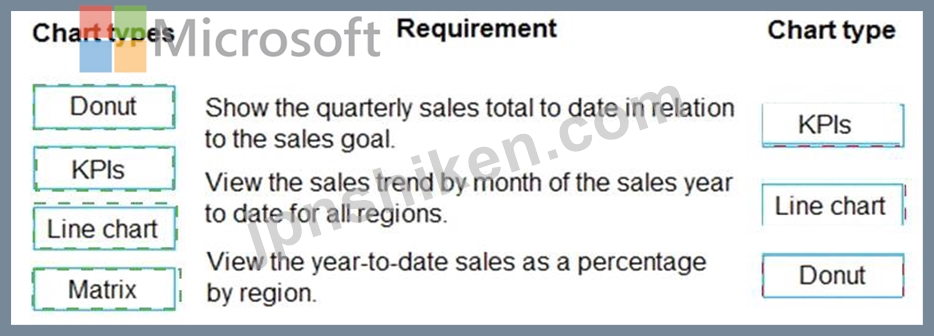
Explanation:
Box 1: KPIs
A Key Performance Indicator (KPI) is a visual cue that communicates the amount of progress made toward a measurable goal.
Box 2: Line chart
Line charts emphasize the overall shape of an entire series of values, usually over time.
Box 3: Donut
Doughnut charts are similar to pie charts. They show the relationship of parts to a whole. The only difference is that the center is blank and allows space for a label or icon.
Reference:
https://docs.microsoft.com/en-us/power-bi/visuals/power-bi-visualization-types-for-reports-and-q-and-a

- 質問一覧「121問」
- 質問1 企業は、Power BIを使用してビジネスシステムのデータを視覚化す...
- 質問2 企業の顧客向けアプリケーションは、グローバルデータ保護規則(
- 質問3 請負業者がプロジェクトに取り組む時間を提出できるようにするキ
- 質問4 手順:次の各ステートメントについて、ステートメントが真の場合
- 質問5 ある会社が、売上を追跡するためにPowerBIを実装しています。 会...
- 質問6 会社は、よくある質問(FAQ)サイトを置き換えるチャットボット...
- 質問7 Power BIレポートがあります。 次の各ステートメントについて、...
- 質問8 ある企業は、IT 部門が構築したクラウド アプリを使用しています...
- 質問9 次の各ステートメントについて、ステートメントがtrueの場合は[...
- 質問10 Power Apps アプリを作成しています。視覚障害のある人でもアプ...
- 質問11 ソフトウェア会社がPower Automateの使用を計画しています。 次...
- 質問12 顧客サービス部門は、Microsoft Dynamics 365 Customer Service ...
- 質問13 この質問では、BOLDテキストを評価して、それが正しいかどうかを...
- 質問14 同僚がPower Appsでアプリを作成しており、外部ソースからのデー...
- 質問15 ある会社は、管理者のマシン上で実行される財務データを記録する
- 質問16 企業は、ユーザーがPower Automateを使用して個人の生産性を向上...
- 質問17 手順:次の各ステートメントについて、ステートメントが真の場合
- 質問18 あなたは自転車を製造する会社のためにPowerAppsソリューション...
- 質問19 あなたの会社は、休暇残高、オフィスの営業時間、旅費ポリシーの
- 質問20 あなたは、着信するセールス サポート コールを処理するためのセ...
- 質問21 ある企業は、営業チーム用のキャンバス アプリを作成します。 ユ...
- 質問22 ある会社は、営業チーム用のキャンバス アプリを作成します。 ユ...
- 質問23 大手小売企業は、Power Apps、Microsoft Flow、およびCommon Dat...
- 質問24 企業がCommon Data Service環境の作成を計画しています。 次の各...
- 質問25 おもちゃの会社がAIビルダーでテキスト分類モデルを作成して、特...
- 質問26 会社がモデル駆動型アプリを構築しています。 アプリに必要なオ
- 質問27 ユーザーがチケットを注文できるようにするキャンバス アプリを
- 質問28 ある会社は、PowerPlatformテクノロジーを使用してソリューショ...
- 質問29 部門用のモデル駆動型アプリを作成します。 モデル駆動型アプリ
- 質問30 ある企業は、顧客保証情報を Microsoft Dataverse に保存してい...
- 質問31 企業は、フィールドエンジニアがさまざまな程度の複雑さでいくつ
- 質問32 Dynamics 365 Salesを使用しています。 顧客のオフィスの場所を...
- 質問33 企業がPower Platformを評価しており、Power AppsとPower Automa...
- 質問34 ある企業は、顧客保証情報を Microsoft Dataverse に保存してい...
- 質問35 会社は住宅用アパートを建設し、販売しています。同社はDynamics...
- 質問36 この質問では、BOLDテキストを評価して、それが正しいかどうかを...
- 質問37 次の各ステートメントについて、ステートメントがtrueの場合は[...
- 質問38 あなたは会社に Power Apps を実装しています。 オンライン独自...
- 質問39 ある企業は Microsoft Dataverse を使用してビジネス データを管...
- 質問40 ある会社が、プロジェクトに関するユーザーからの毎週のステータ
- 質問41 テンプレートを使用してフローを作成します。追加のビジネスシナ
- 質問42 Power Blダッシュボードを作成します。 各オプションを要件に一...
- 質問43 Power Pages サイトを作成して、Microsoft Dataverse データを外...
- 質問44 会社は、Microsoft Excelワークブックを使用して、統合された販...
- 質問45 ある会社がPowerPlatformを使用しています。 ユーザーが顧客デー...
- 質問46 キャンバスアプリが最近更新されました。 この更新により、ユー
- 質問47 いくつかの国/地域で使用されるキャンバスアプリを作成していま
- 質問48 プロジェクト チーム メンバーがタスクを完了としてマークしたと...
- 質問49 手順:次の各ステートメントについて、ステートメントが真の場合
- 質問50 ある会社が独立した著者向けに電子書籍を発行しています。 同社
- 質問51 User1 は、企業向けにいくつかの Power Bl ダッシュボードを作成...
- 質問52 あなたは営業担当者です。 Power BIレポートを作成して、Microso...
- 質問53 会社はウェブサイトを持っています。 Webサイトには、会社がリー...
- 質問54 企業は、Power Automationを使用してビジネスプロセスを自動化し...
- 質問55 ある会社は、Microsoft Excel スプレッドシートを使用して原材料...
- 質問56 ある企業が Power BI の実装を計画しています。 同社は、Power B...
- 質問57 会社のPower Virtual Agentsチャットボットを作成しています。 ...
- 質問58 社内のユーザーは個人の生産性のためにFlowを使用します。 ユー...
- 質問59 ある会社は Dynamics 365 Sales を使用しています。次の要件があ...
- 質問60 Common Data Serviceを使用して、ユーザー所有のカスタムエンテ...
- 質問61 あなたは大規模な小売組織の地区マネージャーです。Power BI を...
- 質問62 Power Appsキャンバスアプリを作成します。 同僚がアプリを実行...
- 質問63 ある企業が、航空産業機器の現場検査とサービスを実施しています
- 質問64 Power Apps開発者には、アプリ、接続、およびフローを作成するた...
- 質問65 会社はMicrosoft Flowを使用しています。 作業指示書が作成され...
- 質問66 次の各ステートメントについて、ステートメントがtrueの場合は[...
- 質問67 あなたの会社は、ヘルプデスクシステムを作成し、Dynamics365カ...
- 質問68 ある会社がPowerBIを使用して視覚化を構築しています。 同社のIT...
- 質問69 企業は、ビジネスプロセスの管理に役立つPowerAppsの実装を検討...
- 質問70 ユーザーが建物内の利用可能な会議室を検索できるように、Power ...
- 質問71 会社はPowerAppsキャンバスアプリを使用しています。 ユーザーが...
- 質問72 カスタマー サービス マネージャーは、サポートを求める顧客のた...
- 質問73 あなたはカスタマーサービスマネージャーです。 お客様がケース
- 質問74 製造会社がAlBuilderを評価しています。 指定された要件に対応す...
- 質問75 連絡先エンティティにビジネスルールを作成して、ユーザーが新し
- 質問76 PowerAutomate承認フローを作成しています。 手順:次の各ステー...
- 質問77 植物や園芸用品を販売する会社向けのモデル駆動型アプリを作成す
- 質問78 急成長している企業は、専門知識や開発スキルを必要とせず、また
- 質問79 企業は、Power Platformを使用して、特定のビジネス上の課題に対...
- 質問80 Power Apps とモデル駆動型アプリにレコード レベルの権限を割り...
- 質問81 5 人のチームが、企業向けの Power Platform ソリューションを作...
- 質問82 Microsoft Excel ファイルから Microsoft Dataverse にデータを...
- 質問83 Microsoft Power Platform に基づいてソリューションを構築しま...
- 質問84 手順:次の各ステートメントについて、ステートメントが真の場合
- 質問85 定義を編集して変更を保存することにより、PowerAutomateフロー...
- 質問86 Power BIのさまざまなソースからのデータを組み合わせるプロジェ...
- 質問87 ある会社は、PowerPlatform環境にPowerAppsを実装することを計画...
- 質問88 ある企業は、住宅および企業の顧客にオンサイトの建築コンサルテ
- 質問89 銀行は、Power Platformアプリとフローを使用してビジネスプロセ...
- 質問90 会社は、モバイル販売活動にモデル駆動型アプリを使用しています
- 質問91 会社がDynamics 365 Supply Chain ManagementとDynamics 365 Fin...
- 質問92 教育機関: 次の各ステートメントについて、そのステートメントが...
- 質問93 ある会社は、Dynamics 365 Customer Service を使用して顧客サー...
- 質問94 Power Appsとトリガーの使用方法について学習しています。 どの...
- 質問95 ある企業が、業界標準の独自のデータソースを使用するPower Plat...
- 質問96 ある会社がキャンバスアプリの作成を計画しています。 必要なコ
- 質問97 会社は、製品と製品保証に関する質問に答えるためのインタラクテ
- 質問98 You are developing reports for a company. You must create vi...
- 質問99 企業は、顧客情報を保存するために Microsoft Dataverse の新し...
- 質問100 企業はAIビルダーを実装する方法を評価しています。 AIビルダー...
- 質問101 あなたは動物病院向けのソリューションを実装しています。 動物
- 質問102 見積もりのリクエストを追跡するためのモデル駆動型アプリを
- 質問103 Power Appポータルを作成します。 ユーザーがポータルにサインイ...
- 質問104 モデル駆動型アプリを作成します。テーブル フォームに対してど
- 質問105 Dynamics 365 SalesとMicrosoft 365の両方を使用するPower Apps...
- 質問106 次の各ステートメントについて、ステートメントがtrueの場合は[...
- 質問107 企業は、AIビルダーを使用してビジネスパフォーマンスの向上を支...
- 質問108 ある企業は、Web サイトに Power Pages の使用を検討しています...
- 質問109 会社がDynamics 365 Supply Chain Managementを使用しています。...
- 質問110 ある会社は、PowerAppsを使用して一連のカスタムサービスに接続...
- 質問111 会社がMicrosoft 365とDynamics 365 Salesを使用しています。同...
- 質問112 Common Data Modelデータを表示するPower Blダッシュボードを作...
- 質問113 Power Automate フローを作成しています。 Microsoft Excel Azur...
- 質問114 ある会社がPowerAppsポータルを構築しています。 ページコンポー...
- 質問115 ユーザーが経費を記録できるようにするキャンバス アプリを構築
- 質問116 企業は Power Apps キャンバス アプリを使用して情報を入力しま...
- 質問117 Microsoft PowerPlatformとともにMicrosoftBusinessApplications...
- 質問118 ユーザーがモバイルデバイスから会社のMicrosoft SharePointプロ...
- 質問119 ある会社は、PowerAutomateを使用してタスクを自動化することを...
- 質問120 あなたの会社には、従来の販売データを含むオンプレミスのMicros...
- 質問121 組織の複数ページの Power BI レポートを作成します。 組織内の...
